What UIUX Can Learn From Post-Modernist Architecture
Lessons product teams could take from a 1972 seminal text in post-modern architecture.
The field of User Interface and User Experience, or UIUX for short, has borrowed extensively from the history and theory of architecture. From the Desktop Metaphor to Information Architecture to Digital Gardens to Brutalist Websites, UIUX uses metaphors from the built environment to make nebulous concepts a little more concrete.
When offices shuttered to give way to work-from-home policies and today’s tweens spent their childhoods on Roblox, we came to terms with the fact that digital spaces started to take over the physical environment as the prime facilitator for human connection.
Unlike personal computers, architecture — and its principles — have been around for millennia. Instead of reinventing the wheel with UIUX, why not revisit some established architectural frameworks? After all, we tech and startup people love our mental models.
Sin City
I read “Learning from Las Vegas,” an influential post-modernist text, in my senior year at design school, right before the pandemic hit. Architects Robert Venturi and Denise Scott Brown outlined their research on the Las Vegas Strip in this 1972 text.
At the time, studying vernacular architecture wasn’t in vogue within academic circles. However, Venturi and Scott Brown persevered and came up with a mode of architectural categorization: buildings were either decorated sheds or ducks 🦆
Decorated sheds are everywhere. Your local mall, boutique, or restaurant, is most likely decorated shed. The family-owned bodega, or sari-sari store, with the handpainted sign on top of the door, is a decorated shed. The most important quality of a decorated shade is its use of signage to communicate its function
Ducks, on the other hand, are the opposites of decorated sheds. They don’t need signs because the architectural form speaks for itself. The term “duck” came from Big Duck, a duck-shaped building located on Long Island. Unsurprisingly, Big Duck was a store that sold ducks and duck eggs. Another duck is the Longaberger Headquarters in Ohio, which is in the shape of a picnic basket. Guess what Longaberger sells 🧺
We have ducks at home!
The dichotomy between ducks and decorated sounds awfully similar to skeuomorphism. According to the Interaction Design Foundation, skeuomorphism refers to “interface objects that mimic their real-world counterparts in how they appear and/or how the user can interact with them.” It’s why those iOS apps from the early aughts looked like digitally airbrushed versions of the real things. Based on this train of thought, duck = skeuomorphism.
What I find so appealing about the “Learning From Las Vegas” model is how clear the dichotomies are when it comes to using a symbol vs. being a symbol. Skeuomorphism has its sleeker, more abstract sibling in neuomorphism, yet we don’t know what the direct opposite of skeuomorphism looks like based on this visual classification on its own. Much like the rest of tech’s intangibility, skeuomorphism, and its numerous offshoots, exist in a strange limbo, especially as the industry innovates at breakneck speeds.
Applying Venturi and Scott Brown’s classification system would help us look at digital products more holistically and how the UI affects the overall experience.
Let’s go through a few examples:
Round 1: Calculator App vs. Excel
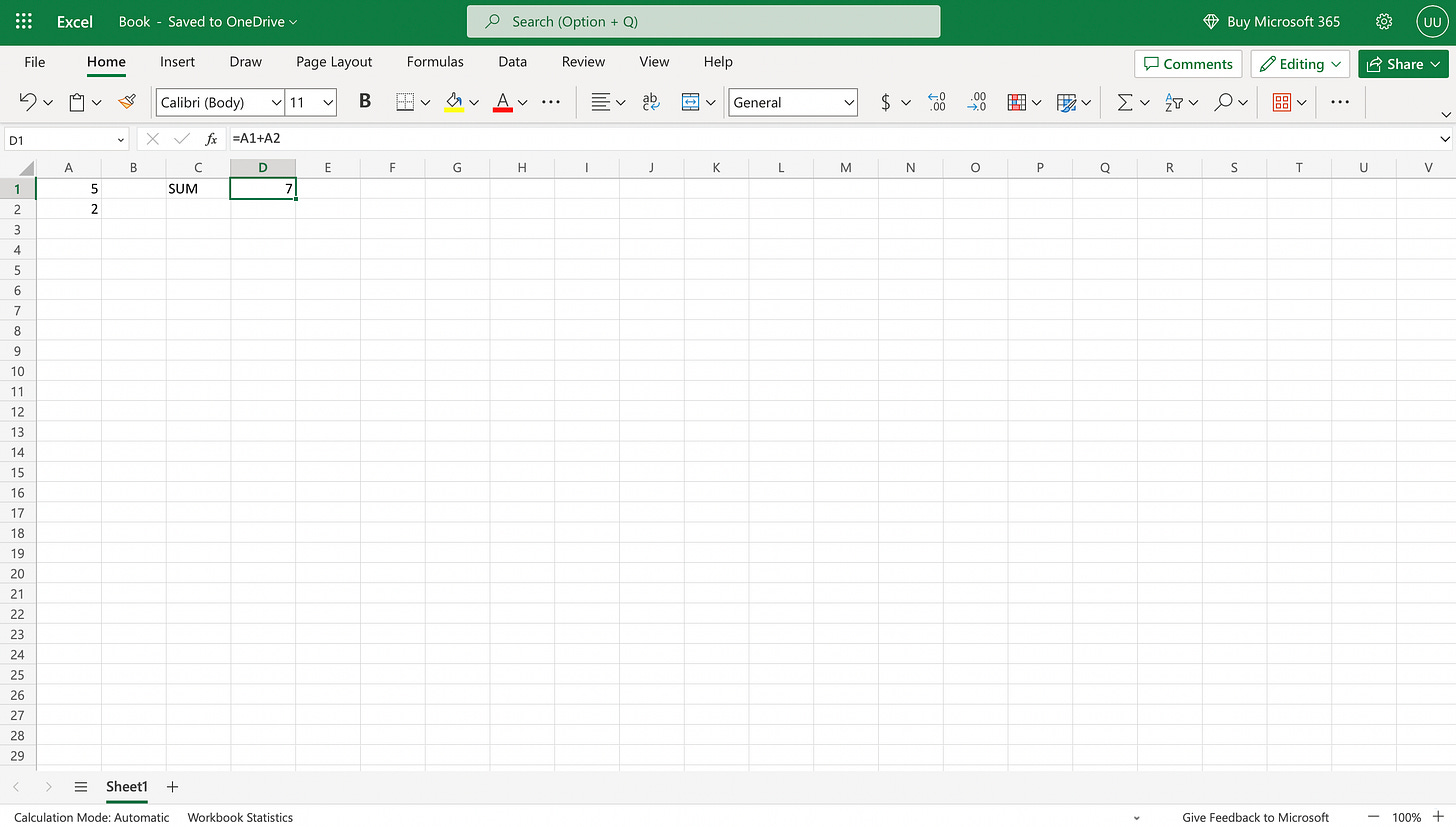
This one’s easy. The Calculator App is a duck, while Excel is a decorated shed.
The Calculator App, especially its earlier skeuomorphic iteration, mimics the experience of using an actual calculator. Instead of our fingers, we use our cursor to push the buttons. The UI is glaringly obvious because it resembles a physical calculator and doesn’t require one to decipher labels and notations.
On the other hand, Excel can also do the same tasks as a calculator, like adding and multiplying. Although, we have to type in commands using symbols and organize our cells instead of pushing (digital) buttons. We could interpret Excel commands, symbols, and even cell names as the signage necessary in a decorated shed.
Round 2: Gudak vs. Dazz Cam
Back in the early days of Instagram, we used filters that made our phone photos look like old, film photographs — scratches and light leaks included. This move on Instagram’s end was partly to get users to feel comfortable uploading what would other be personal photos online (very duck-ish) and partly to capitalize on all things post-2008 hipster core to achieve virality.
Retro image editing apps experienced a meteoric rise. However, these apps, Gudak and Dazz Cam in particular, offer radically different means to the same result.
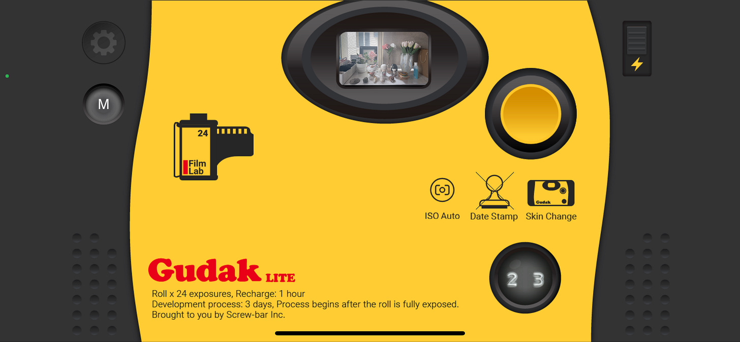
Gudak replicates the experience of taking film photos with all the delights and inconveniences of a film camera. The digital viewfinder is tiny. After users take a photo, Gudak randomizes light leaks and filters. Much like a real disposable camera, there’s no way to change or control the effects. Gudak is a duck.
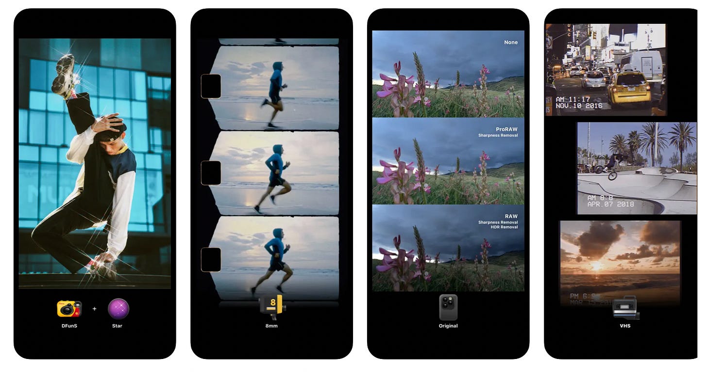
Dazz Cam is a decorated shed. While its interface contains grainy textures and film rolls to appear skeuomorphic, Dazz Cam’s overall experience relies on labels and icons. Users pick their filters based on old cameras. Dazz Cam uses delightful and dimensional pictures of old cameras as icons, which users need to select by tapping on them and prompting a check mark. Dazz Cam’s viewfinder also resembles contemporary smartphones’ large viewfinders. In the 3D plane, we couldn’t have over ten cameras in the space of a pocketbook and we definitely could not change cameras with the swipe of our finger.
Bonus: Dispo

Dispo is one of those apps that rode the early-pandemic nostalgia wave and had a waiting list. It took some cues from Instagram to become, in one way or another, the Anti-Instagram, which advocated for more chance operations and authenticity.
Dispo has a disposable camera interface with a tiny viewfinder and non-changeable filters, which is a duck. These photos then go to a grided social media profile, which looks like a hybrid of Instagram and VSCO — a decorated shed.
Dispo has duck and decorated shed qualities. These layers of abstraction in Dispo’s UIUX may have contributed to the app’s rise. Users got the best of both worlds: an authentic and easy-to-understand main feature coupled with the streamlined and dopamine-heavy sensation of scrolling through social media.
An IRL duck-shed hybrid, that comes to mind is Marina Bay Sands. The elongated cruise lends the three buildings underneath a sense of identity, almost like a fancy sign. However, visitors could go up to the cruise ship and enjoy some food and drinks on the deck.
Since the cruise ship has a function that’s related to the hotel’s purpose of being a luxury seaside resort, that part of the architecture becomes a duck. The unexpected marriage of these two architectural forms is what makes Marina Bay Sands a defining part of Singapore’s skyline.
Digital Placemaking
Our lives are online. We work out of our laptops with a stable Internet connection. We swipe through countless romantic prospects until we find The One. We order our food on grocery and food delivery apps. We do not need to go out. The computer world has become our reality, while the physical realm turned into an escape.
Robert Venturi and Denise Scott Brown have provided a fascinating framework for us to describe and interact with architecture. The decorated shed vs. duck categorization model sorts buildings based on whether their facades use symbols or are symbols. Deciding whether a structure is a duck or a decorated shed is only half the fun.
Ideas in “Learning From Las Vegas” can apply to other placemaking disciplines, such as UIUX. We examined different apps through the decorated shed vs. duck lens. While apps can serve the same function, their interfaces are significant differentiators that affect the whole experience.

I’m hoping that this thought experiment could help you ponder about the types of worlds we’re making online. Architecture has shaped the way we interacted with our environment and with each other for eons. Now that everything has moved online, new, exciting intangible spaces have emerged.
Product teams are in an amazing and enviable position to shape our future landscapes. So, what kinds of worlds will they build?
Thank you so much for investing your time and mind into this article 🖤
I hope it opened new ways of seeing the importance of your work and creativity.
xx Maddy
Images have been properly attributed to their rightful owners. All opinions are my own.
Zero Percent Sugar is a space for review, commentary, and criticism.


